The tangled, time-consuming web
For any organization whose mandate is the health of millions of Canadians, life is complicated. PHSA is no exception. Operating 10 provincial agencies, such as BC Cancer Agency and BC Emergency Health Services, PHSA is also responsible for 13 specialized provincial health services delivered across the province in collaboration with regional health authorities. All in, PHSA has approximately 20,000 full- and part-time staff and physicians, and it acts as an information source for an additional 60,000 staff in other health authorities.
Given its extensive network, it’s no wonder that PHSA ended up with a vast intranet landscape—one centralized intranet and six local ones. But the proliferation of digital space was accompanied by duplicated content and unreliable information.
Consequently, staff at some PHSA agencies became overly reliant on printed material. Others found workarounds in intricately-crafted bookmarked menus or items saved to their desktops. “People did not know where to look for stuff – policies, procedures and all that important information that intranets are supposed to provide,” says Libby Brown, PHSA’s Director of Corporate Communications. “To figure out where you might find something, you really had to understand the history of the organization.”
Facing an increasingly tangled web, PHSA asked us to help create a single, unified intranet experience that would meet the unique needs of their time-pressed employees. “Because for people who deliver care, there are not enough hours in the day,” says Libby.
Prototyping a time-saving future
Our challenge? We had to persuade half a dozen agencies to abandon their existing intranets, a difficult task in a change-saturated environment.
“There was a lot of anxiety around this because change, in our workplace, is so constant,” says Martina Scarff, Online Communications Specialist. “So even though what they had wasn’t great, people were still attached to it.”
A short timeline threatened to make this change-heavy project even more uncomfortable: we had just 12 weeks to create a functional prototype. This meant that our design process had to be communicative and collaborative. We had to build trust with authors and end-users alike, helping them to imagine how a new centralized intranet would meet their unique needs.
To work as closely as possible with as many people as possible, we carried out a series of five-day design sprints. In each sprint, we collaborated with one agency, immersing ourselves in their day-to-day experiences in order to uncover their top priorities. While Habanero consultants Kurtis Beard and Christina Ferancik led the first several sprints, Martina and Karen Giroux gradually took over. This approach not only helped Martina and Karen build skill sets that will continue to benefit PHSA, but it also put PHSA employees at the helm of this project, building relationships to support ongoing operations.
Habanero worked with the agencies that had closely-held intranets, and at the end of eight sprints, we had a highly-functioning prototype that had been designed and refined by clinical staff, administrators, and leaders.
“Working together on the prototype was a fantastic way to get people on board,” says Angela Wilson, Corporate Communications Manager. “Once people saw what the experience was going to look and feel like, it really calmed a lot of fears and built excitement.”
Launching an intranet people have time for
PHSA’s technology development team was eager to build the solution themselves, but they knew that starting from scratch would be expensive and slow. To save money and (more) time, the team used the GO Developer Edition of our GO Intranet Accelerator. Relying on our prototype, they were able to redevelop PHSA on Demand (or POD) in-house.
Soon after launch, it was clear employees were leaning into it: in its first 60 days, POD saw a daily average of 10,650 unique page views and more than 57,000 unique users.
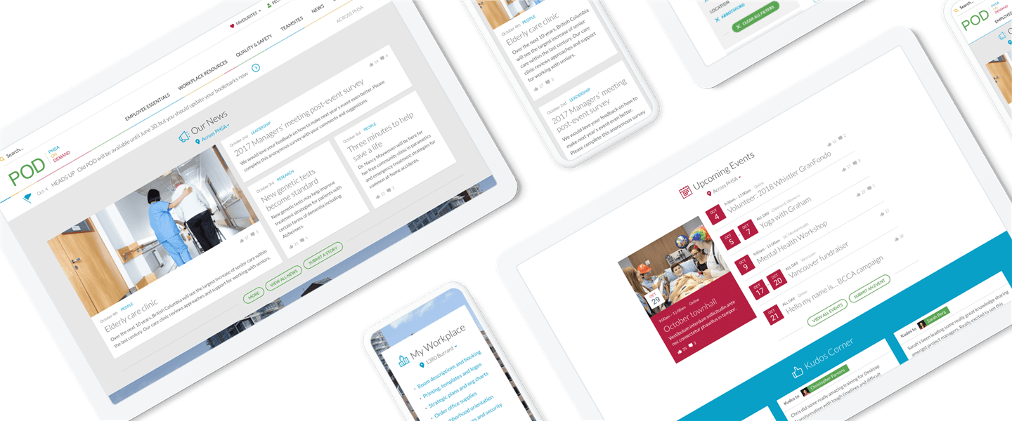
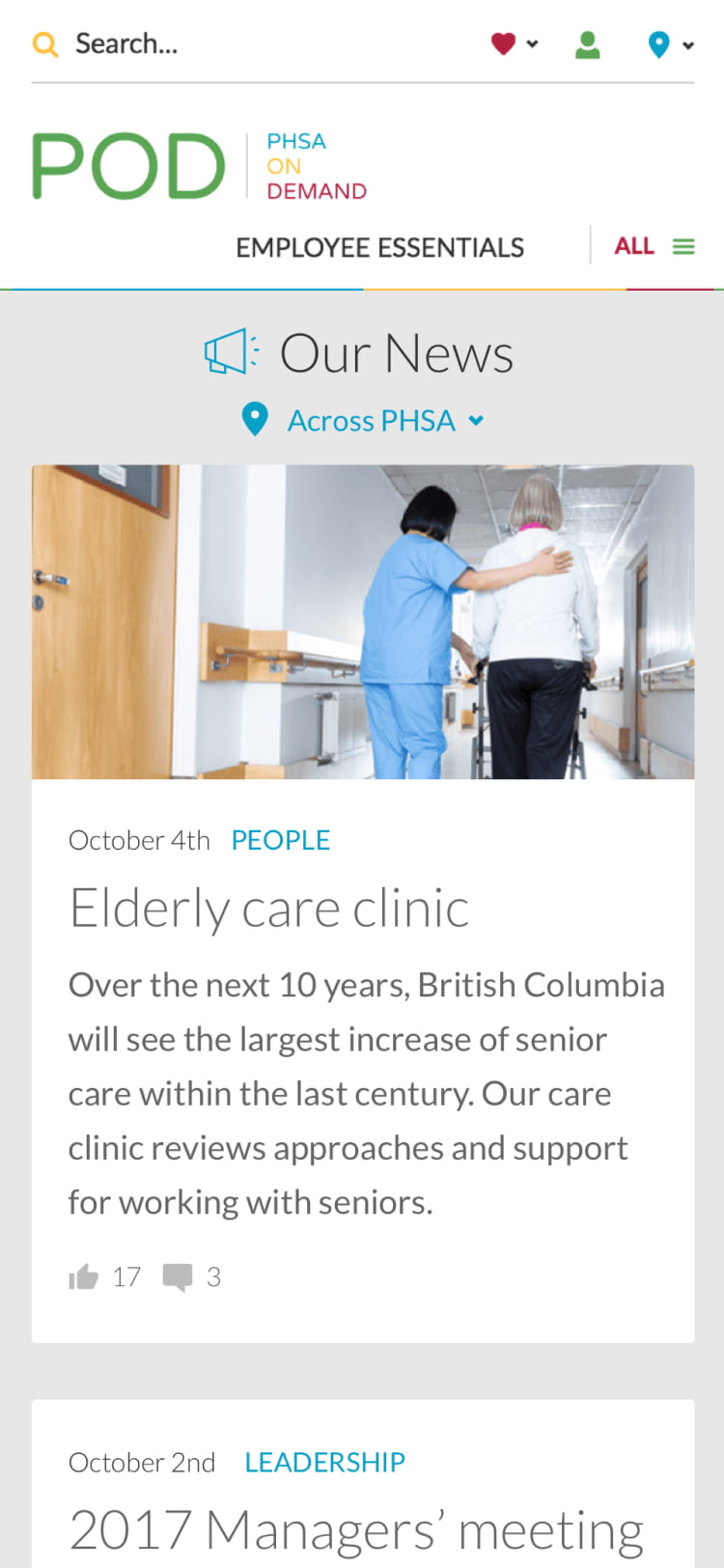
POD’s features are designed to give PHSA staff what they need when they need it. Preferences allow employees to view content—such as news, quick links, and events—based on their unique needs. “Nearly 4,000 people went in during the first two months and set them,” says Libby. My Workplace offers helpful links, tools, and resources specific to an employee’s physical location, and PeopleFinder is available on every page so staff can always find who they’re looking for.
“POD is about providing resources across-the-board for staff,” says Libby. “Where is the directory that allows me to find someone, or the seniority lists for unions? The application for maternity leave? It’s about having what people actually need. Because like any big, complex organization, a hospital has a thousand other priorities, and if the intranet isn’t useful it’s just noise. And who has time for that?”
A deeper look
Putting control in the hands of users
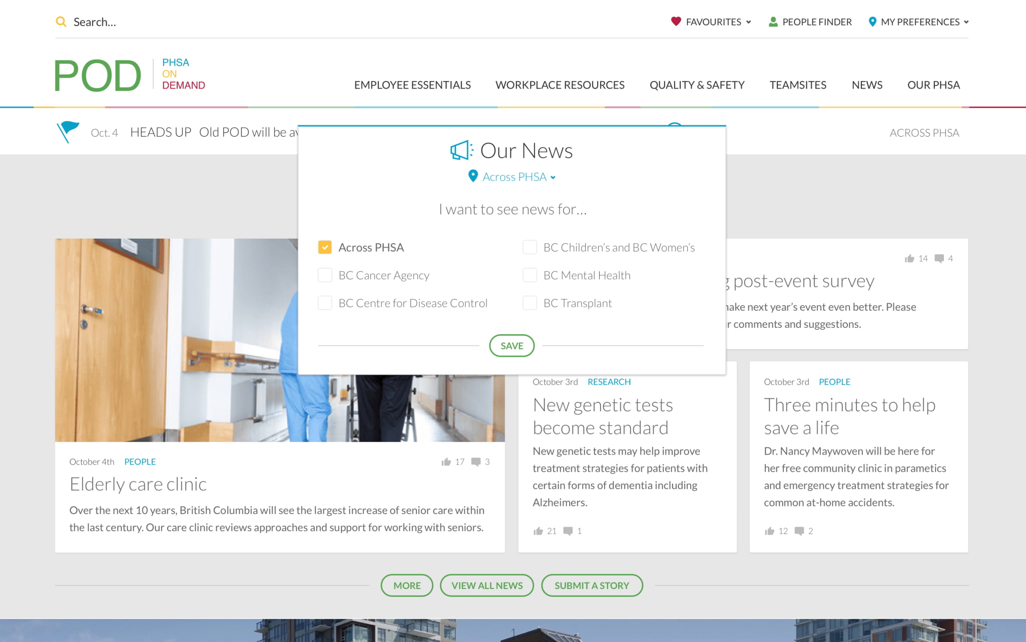
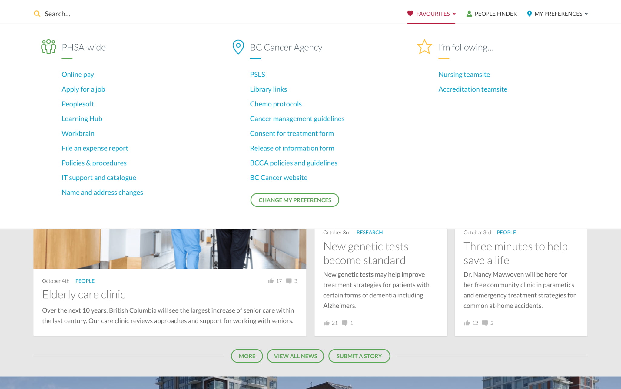
Building content that serves the unique needs of over 60,000 users can be challenging. To put some control into the hands of employees, POD users can set preferences for their agency and location to see information targeted to the entire organization or just to their specific area.
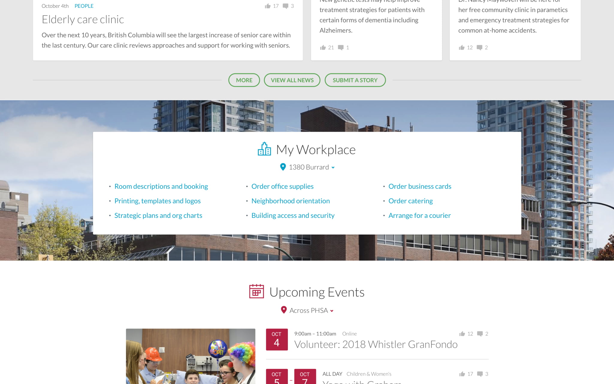
Location-based content
Because many people in the organization need information about their physical workplace, we introduced a home page location panel. Users are able to set their location preference and see links to information about their office location, such as parking, security, transit, meeting rooms, visitor information, and neighbourhood amenities.
Targeting commonly used content
Once users set their agency and location preferences, a favourites list–featuring common links and frequently-accessed agency resources–sits in the main navigation inside POD.
Enterprise-wide recognition
During the sprint process, employees told us they wanted more sharing between agencies. The feedback from employees helped shape the implementation of new capabilities such as an enterprise-wide recognition feature, and supports an intranet goal of creating "One PHSA".
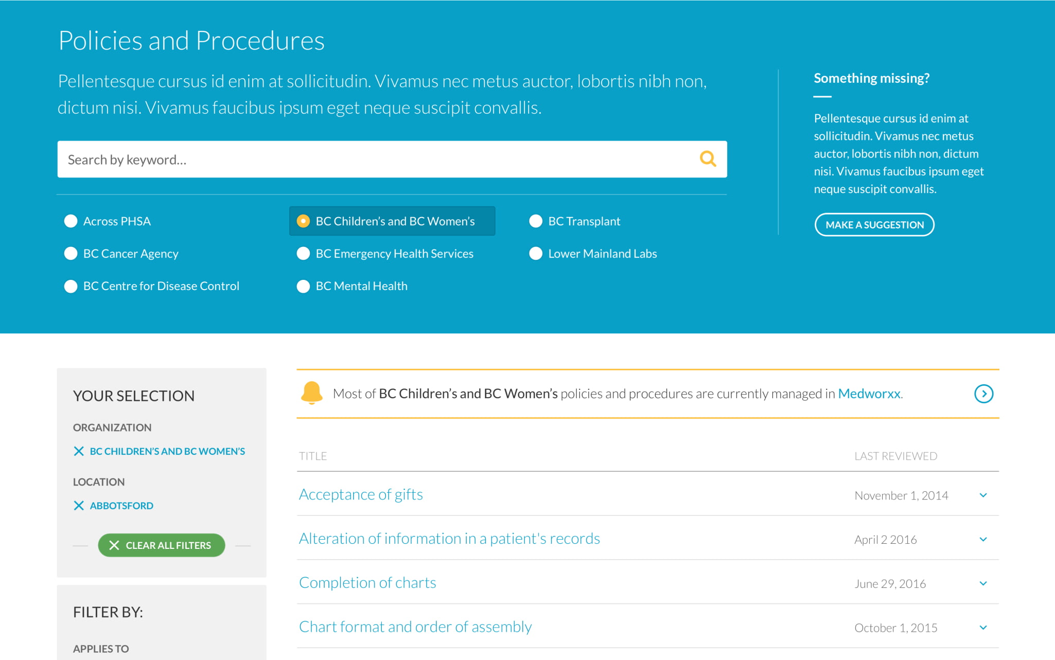
Making Policies & Procedures easy to locate
POD reimagines key content areas, such as Policies & Procedures and other workplace resources, bringing them together into a single, simple experience. Search-and-filter features ensure users can quickly navigate the content environment.




.jpg?la=en&mw=1025&modified=20211119234443&hash=4548E48AA4D85CE6E8084AE5D7E67460263900BC&hash=4548E48AA4D85CE6E8084AE5D7E67460263900BC)
.jpg?la=en&mw=1025&modified=20211119234756&hash=09CA97DC30072BE0BA9DA0A94374AD3C01E0580B&hash=09CA97DC30072BE0BA9DA0A94374AD3C01E0580B)
