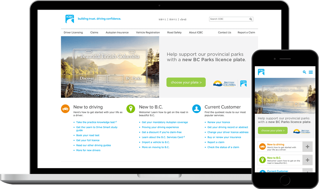
A frictionless experience for all devices
Instead of creating a separate mobile web presence, the existing desktop site was used to craft this responsive solution. Habanero adapted the code, design, and features from the current site, but reformed some of the interactions and elements to better suit mobile devices. The revamped customer portal replaces the previous standalone mobile experience.
Now, ICBC has a cohesive digital presence to showcase its services to drivers across British Columbia.
Habanero adapted site content for the responsive solution to ensure that every piece of information is accessible from any device. This action eliminated the need to make assumptions about which content types users wanted from the mobile version of the site. In terms of usability, navigation and page elements were optimized for smaller screens, creating a streamlined experience across desktops, tablets, and mobile devices.
Habanero conducted analytical, design, and user experience research to determine the best way to revamp ICBC.com’s mobile experience. A central part of this process was a series of collaborative requirements sessions that made it easy for stakeholders to determine objectives, portal features, and outcomes. The solution is built on top of the company’s SharePoint 2013 public website.
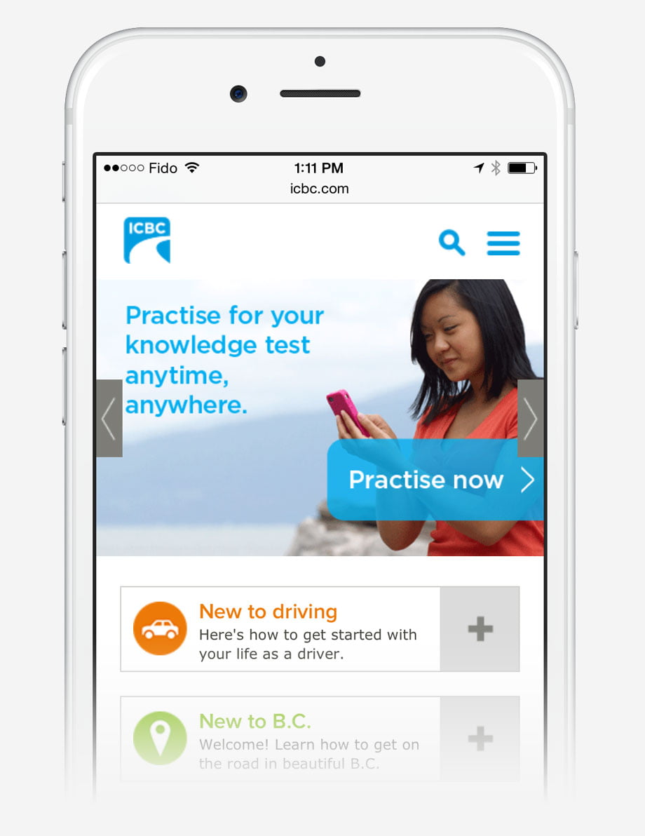
Homepage
The desktop version’s layers and hover menus were re-engineered to provide a smoother experience for mobile users. This included crafting new panels and reorganizing some site content to ensure important information is easy to find on a smaller screen.
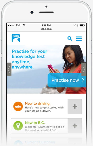
Online practice knowledge test
Mobile devices could not support the old Flash-based version of the test. The new responsive edition required no backend revamps and is designed to accentuate user interactions.
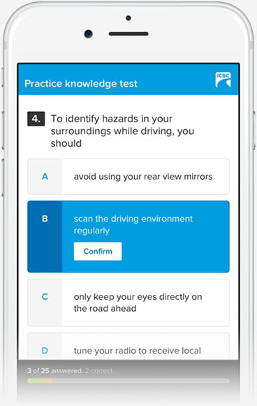
Navigation
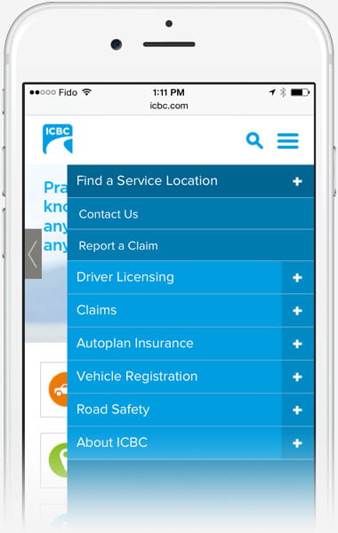
The icon in the top right enables users to drilldown to content, find pages they want, and collapse the navigation bar with just a few swipes and taps. This removed the need for complex hover menus and other elements that complicate responsive layouts.
A mobile-friendly experience
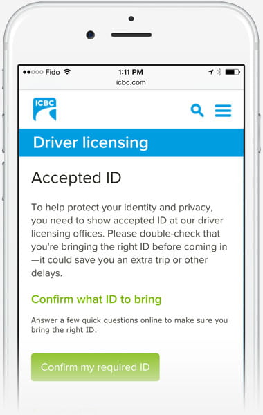
Streamlined design elements ensure smaller browsers are able to provide a rich experience for every device. Tables and carousels were optimized to display on narrower screens, and primary actions are up front to ensure easy navigation.
Tracy BainsWe’re committed to increasing online and mobile services to our customers—and this work has been pivotal in helping us keep our promise.
Manager, Digital Content, ICBC
The solution resulted in:
- 20% increase in overall mobile traffic to ICBC.com
- 201% increase in views of the Online Practice Knowledge Test
- 38% decrease in the bounce rate of the Online Practice Knowledge Test
- Visitors are 16 times more likely to interact with content compared to the previous mobile site


