Alberta Energy Regulator has a website that communicates its role to a diverse audience.
AER is an organization created to meet the needs of today's energy industry, and its website follows the regulator's vision to be recognized as best in its class. AER's website was integral to the launch of its new brand, both within Alberta and around the world.
Habanero's information architecture and design strategy combines new AER information with content from the previous Alberta Environmental and Sustainable Resource Development and Energy Resource Conservation Board websites. One of the key parts of this engagement was to ensure both former regulatory entities were represented within the new AER site. Habanero's consultants made sure old site content was included in the new AER portal, but also came up with a flexible information architecture plan for employees to add content as the organization grows. This is especially important in AER's case because its communications team relies on the website to share information about the new organization.
AER's website traffic is a mix of industry stakeholders and members of the public. The detailed Alberta energy regulations are difficult to communicate without a strong information architecture plan, and the new website gives interested parties the ability to find what they need to know quickly and easily. Habanero focused on every possible site user to make sure AER's website could be an information source for anyone.

Simple navigation
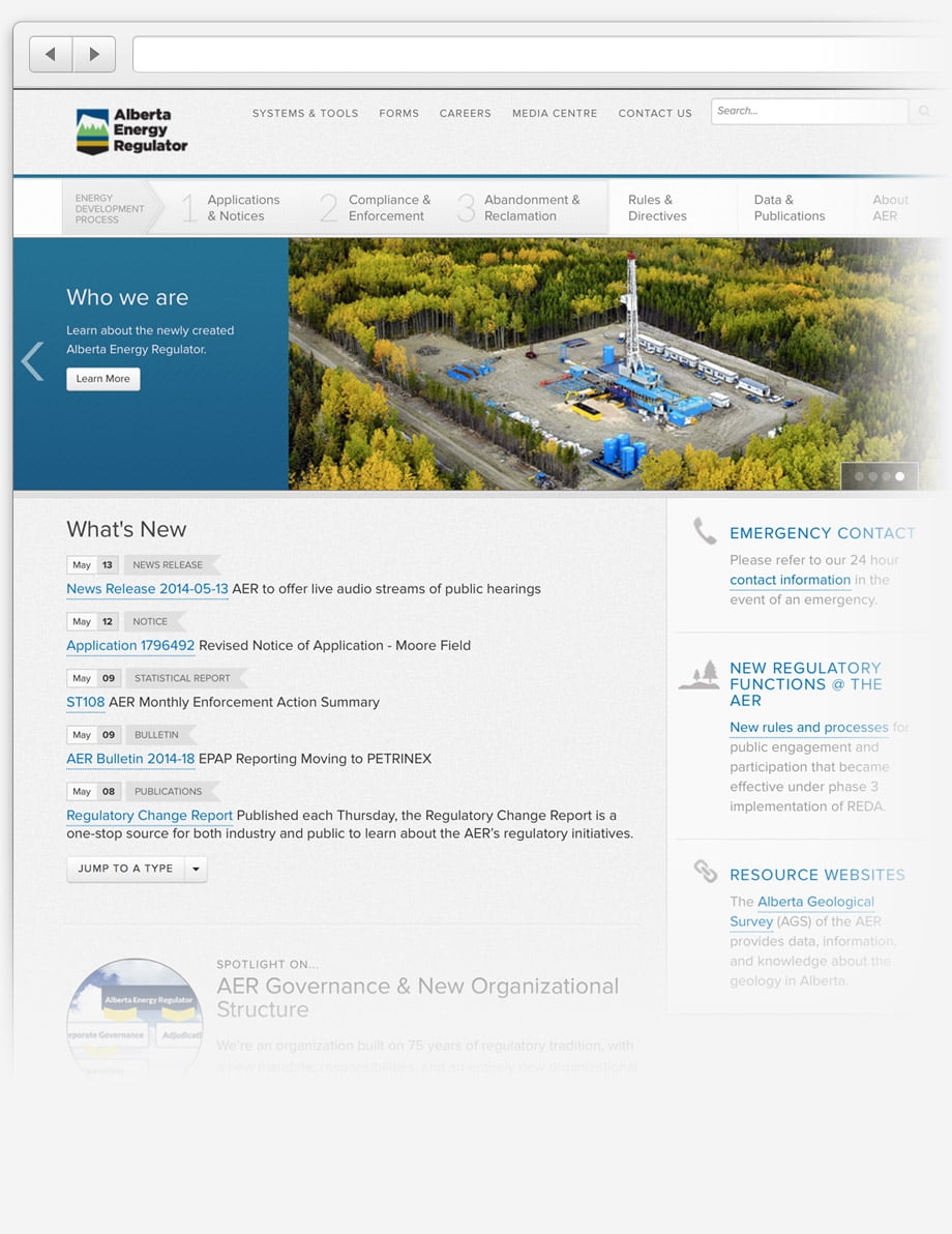
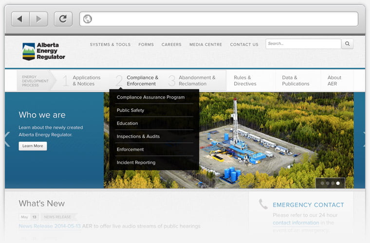
Visitors can navigate through all three steps of the energy development process, right from the home page. This way, people can see where they can get involved and energy stakeholders can become familiar with Alberta's energy regulations. The previous site displayed this information in a way that made sense to energy professionals, but not necessarily to regular citizens who wanted to know more about the process.

Redesigned system and tools page
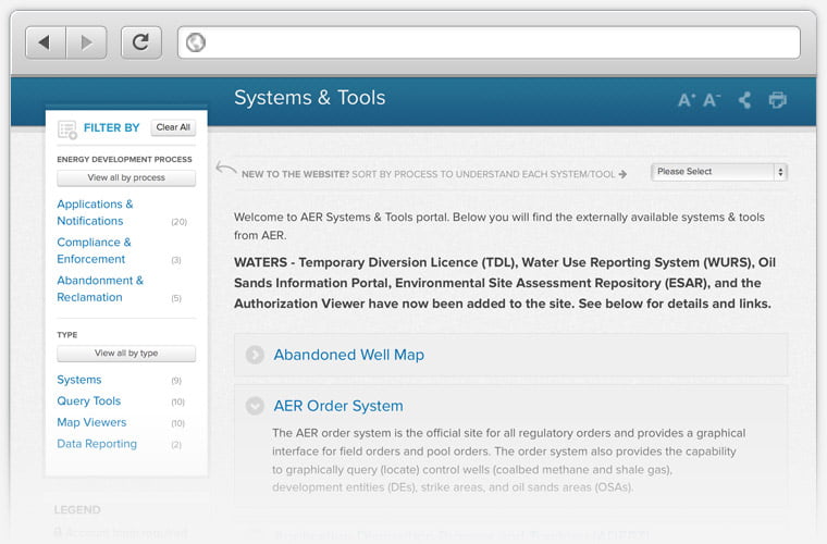
The systems and tools page is used by energy professionals and outside stakeholders. Now, visitors can filter content based on where they are in the energy development process or click on individual tools from the main menu. This redesigned information architecture process was a huge part of making sure people can find what they need on AER’s site.

Accentuate the brand
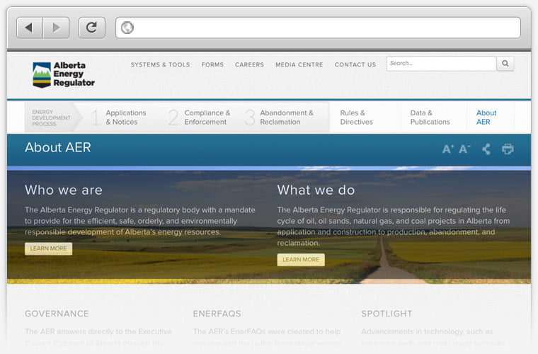
The user experience and information architecture design shows off the visual part of AER’s new brand, but also puts essential information about the organization in easy-to-find places. This was done to ensure the site's user experience supports AER’s role in Alberta's energy industry.

Kaylen Gray-WesleyHabanero came up with an open, nimble information architecture that helped us work through our rebrand and create a website that fits our organization.
Senior Web Advisor, AER


