

We’re working to create better experiences for everyone by taking an accessibility-inspired approach to all facets of our work. As part of our journey to embrace accessibility in design, we’re sharing a series of insights that document our process and learning.
In our last post, we talked about inclusive language. In this article, we’re going to talk about screen readers and how we plan for them in web experiences. How to execute this plan isn't something only designers need to think about; developers, researchers and content writers should consider it too.
What are screen readers?
A screen reader is an assistive technology (AT) tool designed to help people access visual information through braille, speech, or both. Although screen readers can be used by anyone, they're typically used by people who are blind/visually impaired or hard-of-hearing or people who have a cognitive, learning, reading or motor disability.
There are several screen reader softwares out there, but here are some of the most common ones:
- NVDA (Non Visual Desktop Access)
- JAWS (Job Access With Speech)
- Dolphin SuperNova
- Orca
- VoiceOver (Mac OS X)
What concepts are important for us as designers to know?
We want to make sure that our web experiences are accessible to everyone, including people who use screen readers. Here are some of the things you should keep in mind while creating your designs:
- Follow a logical, linear layout – A screen reader guides the user through the web experience based on how the page is structured in HTML code. It’s important to make sure your code accurately reflects the visual design and layout of your page.
- Use proper HTML markup – If you’ve created text hierarchy in your design to indicate page structure through size and weight of the text, that’s only half the work. Ensure your HTML uses elements such as headings, lists, etc., so the screen reader can correctly read out your content.
- Write proper alternative text (or “alt text”) – This text is read aloud to the user to help them understand what the image is. Think of how you'd describe an image to someone in a phone conversation.
- Design for keyboard use – People who use screen readers often don’t use their mouse either. Ensure that your page can be navigated using only your keyboard.
- Use descriptive links and headings – ”Read more” links aren’t helpful for any user, whether or not they’re using AT. These link labels force the user to read the page copy through to make sense of where the link will take them. One of the cool features of screen readers is that if someone doesn’t want to read a full page, they can instead choose to listen to a list of all the headings or links on the page.
- Test out the experience for yourself – If you can’t do it, how do you expect anyone else to?
Although there are so many aspects to screen readers that we could write about, in this post, we’re going to focus on three areas: alt text, focus states and ARIA. Why these three areas? A web experience feels incomplete without them. While a website can technically launch without incorporating them, our goal is go beyond those guidelines. We want to provide a comprehensive experience for all users, regardless of their abilities or disabilities.
Alt text
Alt text is copy that describes an image on a website. A screen reader will read this text aloud to the user to help them understand what the image is. If an image fails to load on a website, its alt text will tell the user what should have been there. Most importantly, without alt text, we’re excluding blind or low-vision users from our experience.
We all know we should be writing alt text, but how do we do it well? Different images require different approaches, and it always depends on the surrounding content of the image. Here are some tips to get you started:
- Don’t include photo credits and copyright information. This can be included in the image caption instead.
- Remove redundant phrases like “image of” or “photo of.” Screen readers tell users that something is an image. You can describe the type of image (i.e., headshot, graph, screenshot, etc.) if it helps to provide context.
- If there is information that all users need, include it in the image caption or page copy.
- Don’t repeat information in the alt text that already appears in the caption or body content of the page. This will cause the text to be read multiple times by a screen reader (talk about a poor user experience!).
- Don’t focus on identifying details unless it’s relevant to the context. Avoid assuming things like gender, race or ethnicity unless you are sure the person wants to be identified that way.
- What’s important about an image depends on context. Take the surrounding content and audience into account when writing alt text.
Here are a couple of scenarios that we’ve run into on our website:
Screenshots
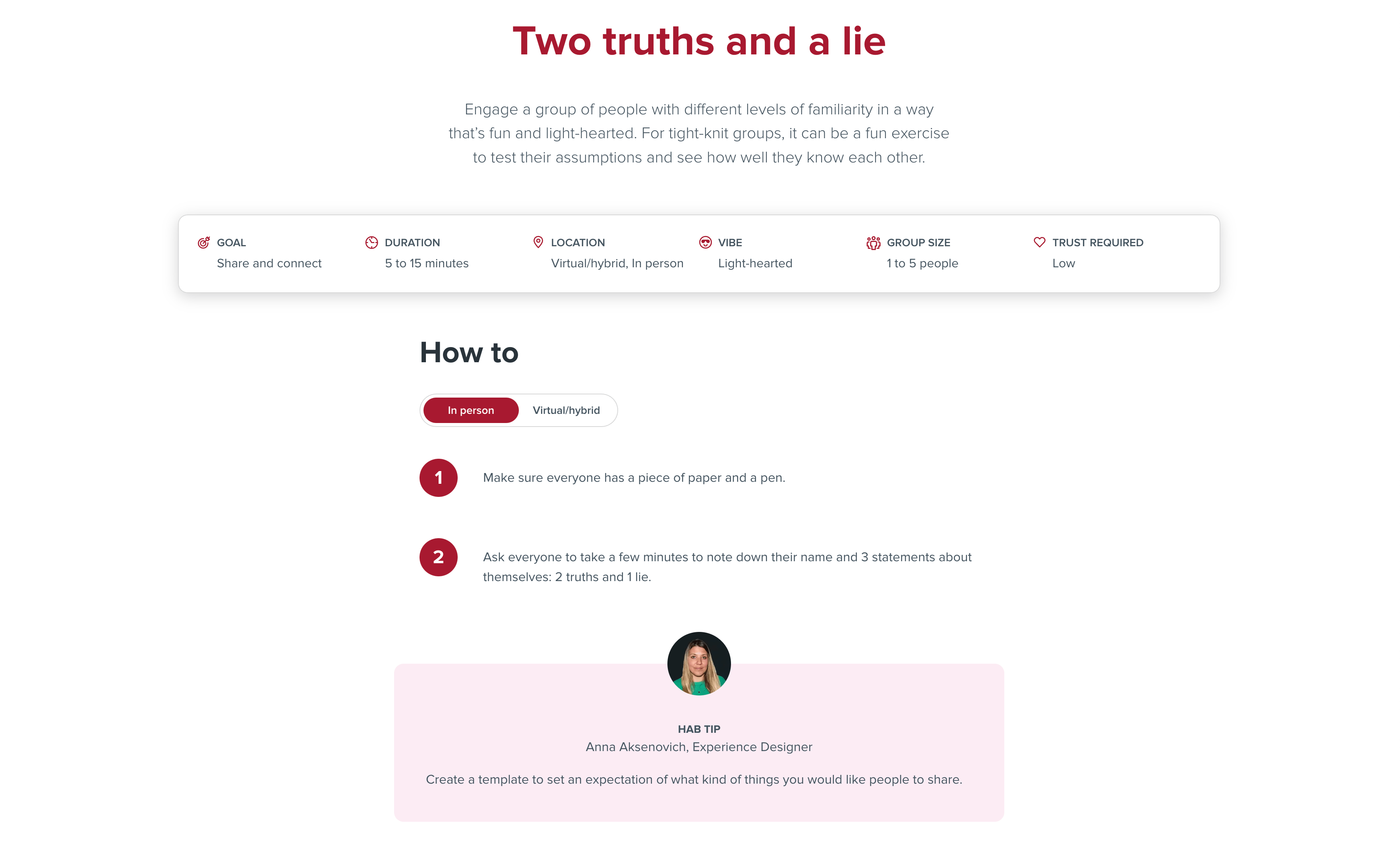
We work on a lot of web experiences like websites and intranets. When we want to show this work on our website, it most commonly shows up as a screenshot. In these instances, we typically start our description with "a screenshot of" as it helps give context to the type of image it is.
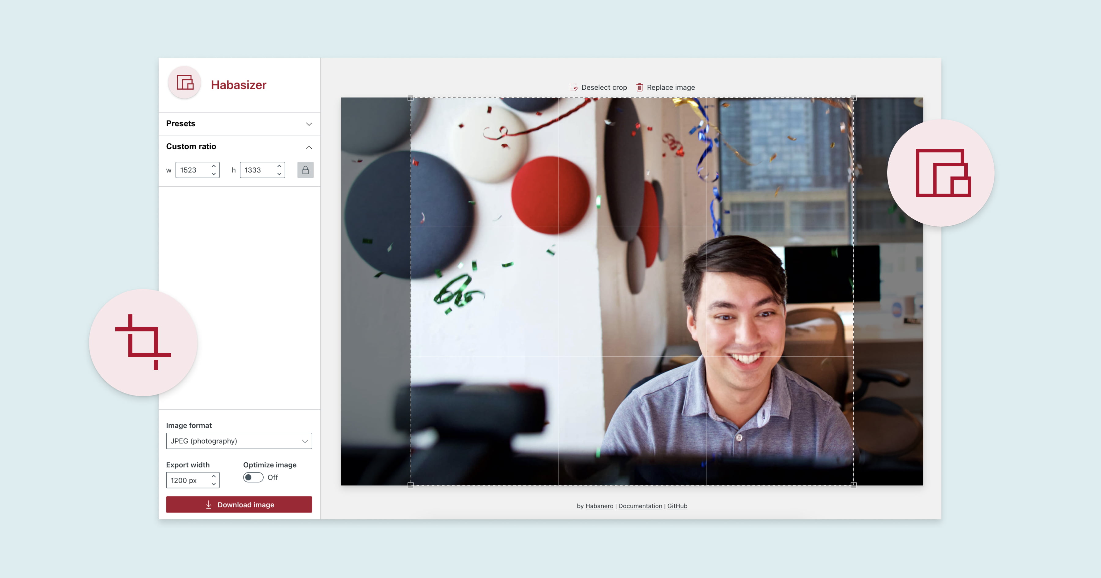
❌ Alt text: “A screenshot of the Habasizer using a photo of Chris Parsons.”
✅ Alt text: “Screenshot of Habasizer photo editing tool. Within the tool is a photo of a man sitting at a desk smiling and the tool's interface shows options for presets, image format, export, and download.”
Illustrations
Most of the pages on our website have a tryptic-style illustration. We use illustrations as a way to create delight and showcase people. If you were to think about describing this illustration, it could get pretty complex and wordy! We don’t include alt text for these types of visuals because although they're fun to look at, they aren't critical to the user's understanding of the page content.
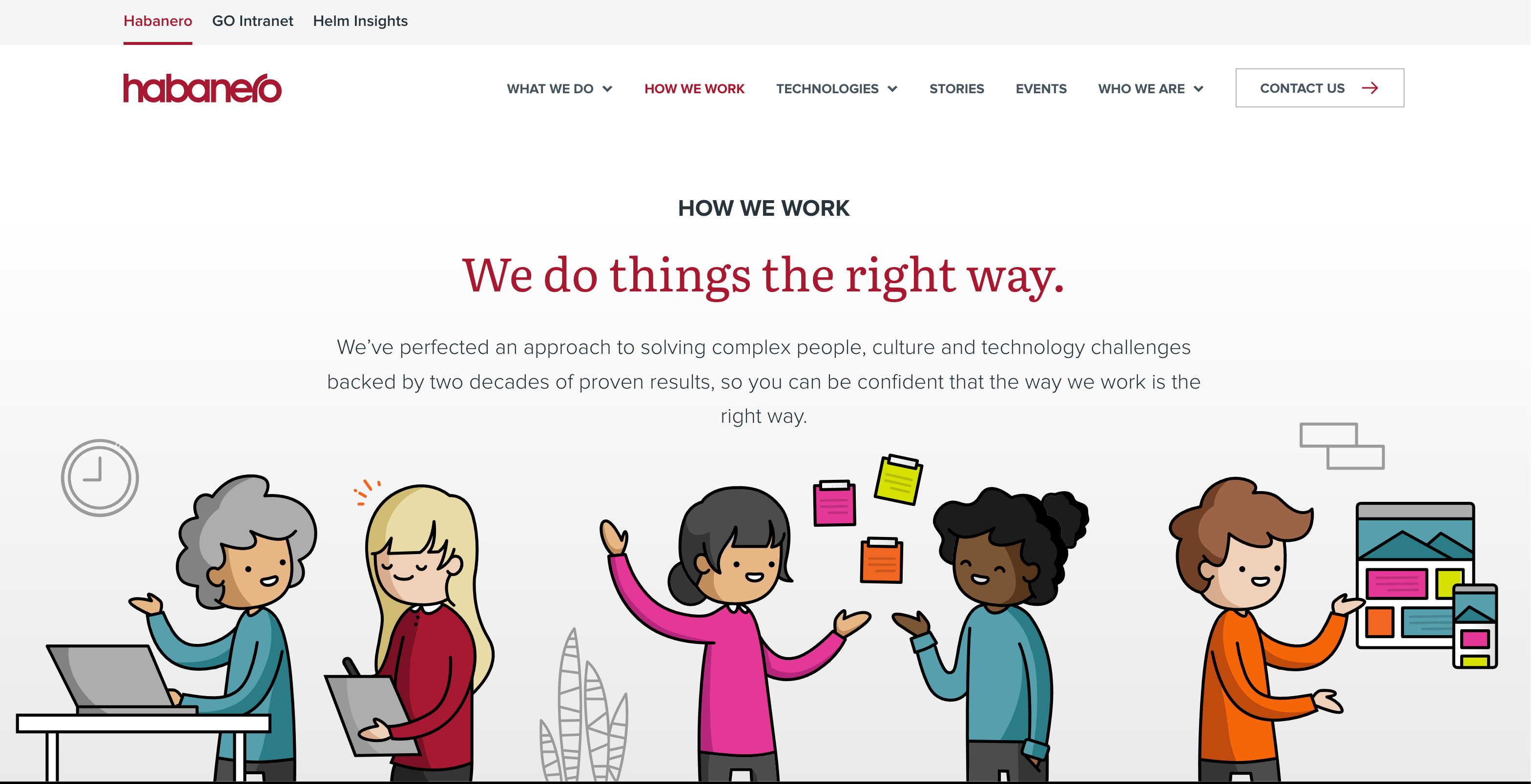
❌ Alt text: “A tryptic illustration with one person working on a laptop and interacting with someone holding a clipboard, two individuals in the middle taking and putting post-it notes on the wall, followed by an individual showing off a desktop and mobile mock-up of a website.”
✅ Alt text: [keep this empty!]
Icons
When we use icons on our website, they're there mostly for decorative reasons. They help break up the content and make it easier to parse information, but you don’t need to know what they are to understand what you’re reading!
❌ Alt text: “Heart icon”
✅ Alt text: [keep this empty!]
Focus states
A focus state is a visual indicator that highlights the element you’re currently focused on and activates it for interaction. People who use keyboards to navigate sites typically press the “tab” key to move from one focusable element on the page to another. When users tab their way through the page, focus states allow them to visually see the elements they’re focusing on so that they’re not lost on the page. Typically, focus states are presented as a rectangle or outline drawn around an element.
How do I make my focus states accessible?
WCAG’s success criterion 1.4.11: Non-text Contrast (Level AA) tell us that the visual presentation of the following must have a contrast ratio of at least 3:1 against adjacent color(s):
- Visual information required to identify user interface components and states, except for inactive components or where the appearance of the component is determined by the user agent and not modified by the author;
- Parts of graphics required to understand the content, except when a particular presentation of graphics is essential to the information being conveyed.
Still confused? Here’s a great example to make sense of it:
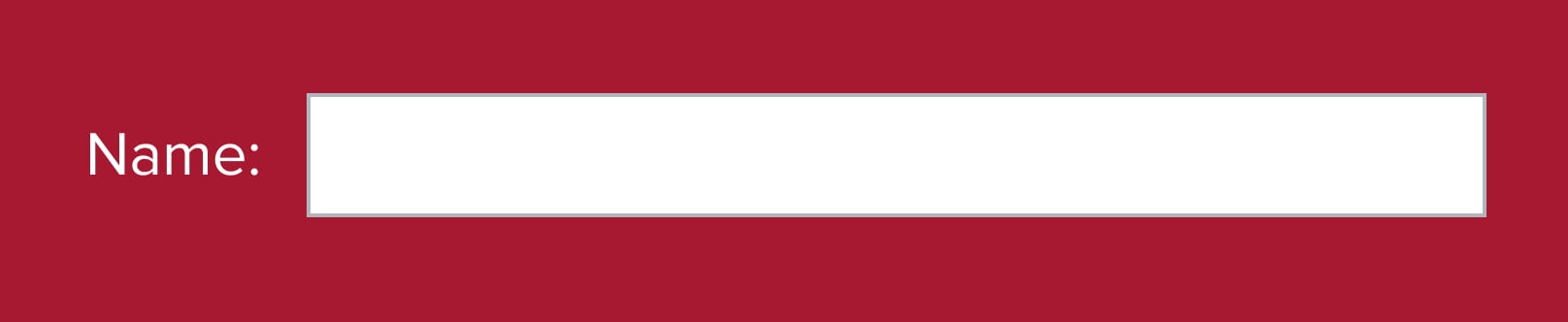
- This form input field has a light background on the inside (#FFFFFF) and sits on a red background (#A71930).
- The input field has a dark grey border that blends into the dark background.
- The border doesn't affect how a user identifies the component, so the contrast ratio is measured between the white background and the colour adjacent to it (the red background).
How far should you take focus state design?
Your browser’s default focus state may not always be very noticeable. If your background colour is similar to your focus state colour, it can be hard to see. By creating custom focus states, you’re not only able to ensure that your users can see them, you can also make them on-brand with your overall design.
Just remember that your focus state must have a minimum 3:1 contrast ratio with the adjacent colours.
How different should a focus state be from a hover state?
Focus and hover states often get mistaken for the same thing when they are actually different!
Hover: the state that shows when you put your mouse cursor over a button. This state does not exist when you don’t have a mouse.
Focus: the state that indicates that your element is highlighted and activates it for interaction. Focus states are independent of the mouse, allowing an element to be focused without the mouse being nearby. This state can be seen by both mouse and keyboard.
Focus states that use colour and additional visual cues
For a good example of web accessibility, check out GOV.UK's website. Their website might not be the most “designed” site, but it is highly usable when navigating with a keyboard.
In the focused state, their links have a yellow background with a thick, black bottom border. We initially wondered how yellow on a white background could pass contrast standards, so we did some digging.
Remember, as we mentioned above, the specific rule for focus states and contrast with their background is covered under Success Criterion 1.4.11 - Non-text Contrast. It ensures that interactive elements are distinguishable from their surroundings, including when they are in a focus state.
Here's how GOV.UK’s link focus states meet accessibility requirements:
-
✅ The visual treatment of the focus state creates an obvious difference between different pieces of content (which is the main point of SCR31).
✅ The focus indicator has a contrast ratio of at least 3:1 against the surrounding colors (black text and yellow background).
✅ The combination of a yellow background and black border creates a highly distinctive visual cue, meeting the 2.4.7 Focus Visible requirement.

Accessible rich internet applications (ARIA)
ARIA refers to a set of more than 150 declarations that can be added into web code so that screen readers and other assistive technologies can understand how to present the page.
Accessibility tools are designed to understand almost all content and input types. Typically, most webpages are accessible by default, which means they don’t require much extra effort from designers or developers. So, if you’ve coded your page correctly, HTML should work.
However, nothing with designers is ever easy (don’t worry, we can say this because we’re both designers). We love pushing the boundaries of digital experiences and creating innovative, exciting designs. Sometimes these designs cannot be made accessible with normal semantic HTML, so our developers must add ARIA to the code.
We recently created a website that has a collection of meeting kickstarters to help teams feel connected and energized for meetings, and it uses ARIA! Specifically, we used the React Aria library to handle our tabs and custom dropdowns.
Custom dropdowns
We wanted to make the experience of searching for kickstarters intuitive and easy to use, so we implemented a multi-dropdown bar that allows users to filter by multiple options. What looks like a simple interaction pattern is actually quite complicated to create! You need controls to open the dropdown, display the list of options, select one or multiple items from the list, show the user the selected items, and close the dropdown.
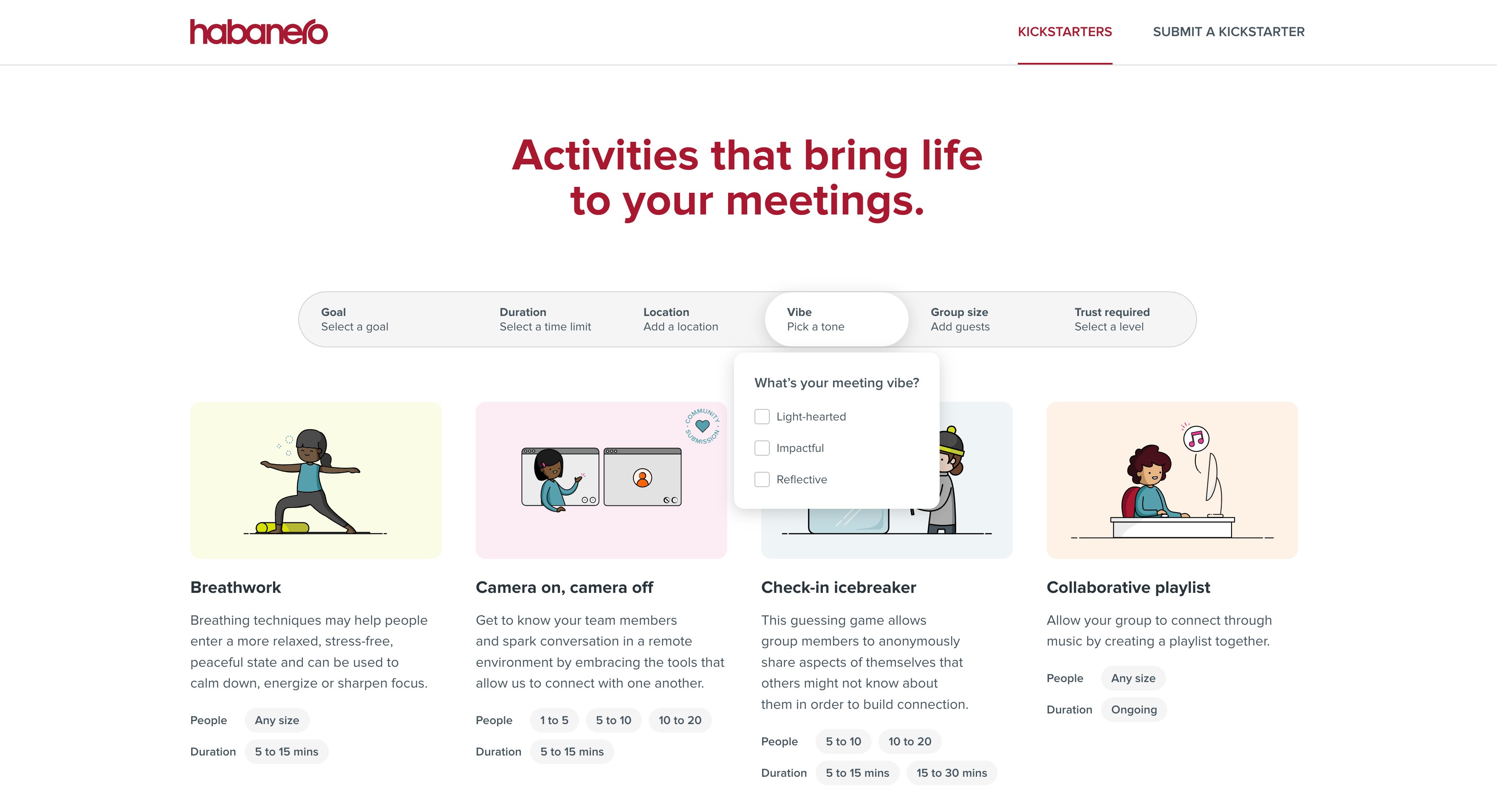
Tabs
Tabs are a common design pattern on websites for good reasons. They effectively save space and organize content while allowing users to easily select and engage with the information they find most relevant. On our Kickstarter site, we use tabs to differentiate between activities that can be done in-person or virtually. This makes it easy for users to find the content relevant to them and visually indicates that the activity can be completed in various locations. We use ARIA in this instance because no HTML element exists to define tabs. Attributes like aria-selected, aria-expanded and aria-labelledby help accessibility tools understand which tab is currently selected.
Try using a screen reader yourself!
As people who are passionate about human-centred design, we wanted to try and step into the shoes of those who would be using a screen reader first-hand. Of course, our test did not make us fully understand what these users go through, but it allowed us to be so much more empathetic about the people who use them. If you’re new to screen readers like we were, here’s the activity we did that you can try yourself!
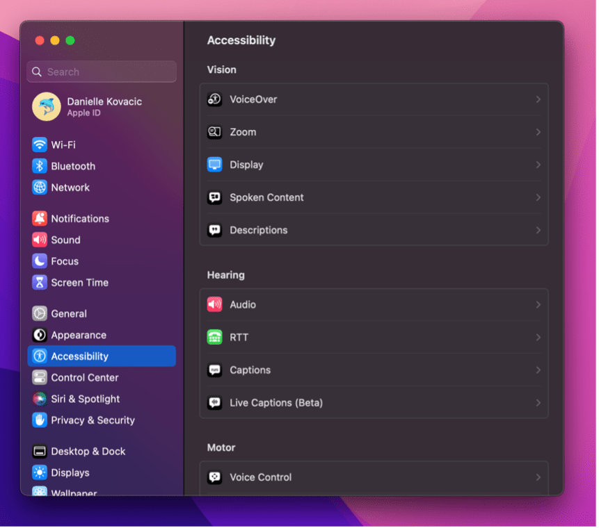
Note: This activity is for Mac users as it uses Apple’s built-in screen reader application, VoiceOver.
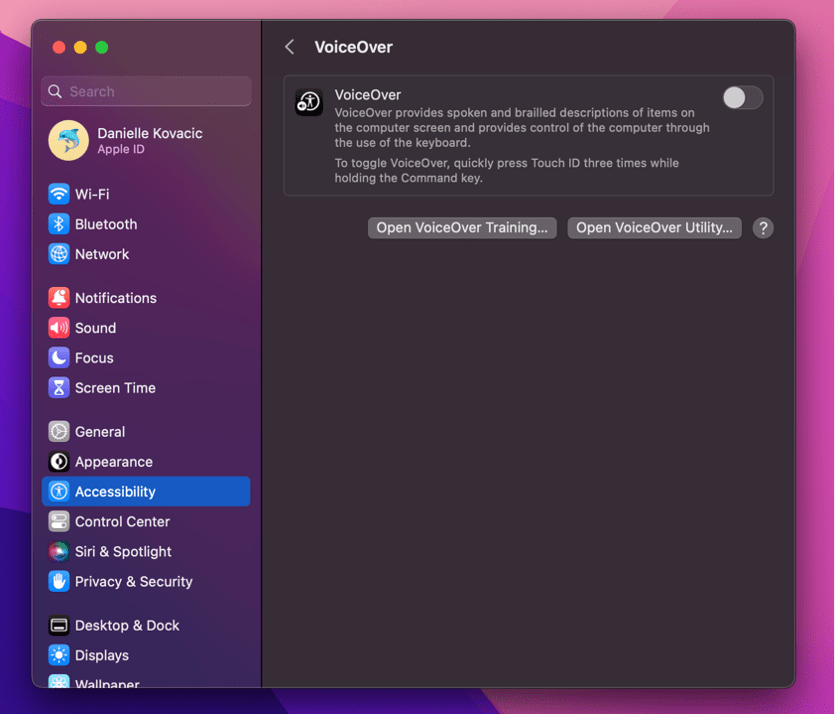
- Open System Settings > Accessibility > VoiceOver.
- Go through the VoiceOver Training. It'll help you understand how to move through web pages and into components such as lists and accordions.
Tip: You can set the VoiceOver modifier to be the Caps Lock key or the Control + Option keys pressed at the same time. - Once you've learned how to go through the page, go to a site that you visit often and try moving through it!
- Reflect on your experience. What did it feel like to navigate through the site? What surprised you? Did experiencing it first-hand change how you would think about screen readers moving forward?
Want to learn more?
If you’re interested in reading more about this topic, here are some other articles that we enjoyed reading:
- What are screen readers? by Equalize Digital
- Screen readers by the American Foundation for the Blind (AFB)
- 10 free screen readers for blind or visually impaired users by John Oldman
- How to document the screen reader user experience by BBC
- How people with disabilities use the web: tools and techniques by W3C
- Providing accessible names and descriptions by W3C
- 12 Screen reader facts for accessible web design by Paula Borowska
- A guide to designing accessible. WCAG-conformant focus indicators by Sara Soueidan
- Non-text contrast (Level AA) by Web Accessibility Initiative
- Complex images by Web Accessibility Initiative
- Active, hover and focus states for designers by Corak
- What is a screen reader by Access Lab
- Writing alt text for images by Illinois State University
- Designing for users of screen readers by Lewis Wake


