Welcome to the fourth installment in the designing modern SharePoint pages series! Previously we shared our insight into designing how-to pages, landing pages and content pages. Now we’ll look at another intranet staple: news articles!
In case you’re new to news articles, they’re commonly used to communicate timely information to the members of your company and are usually featured on an intranet home page. In this post, we’ll share our design tips on how to make immersive and compelling news articles. As usual, we’ll highlight components that you can use and our pro tips on the best way to use them. Let’s go!
Give your news article a job
We recommend defining jobs for all your pages templates. What is the job of news articles? News articles inform employees about a recent topic, story or event. They can also be used to keep evergreen content top of mind by drawing attention to sections of your intranet that have been updated. Unlike most other pages on an intranet, news articles are the perfect place to encourage discussion, so make sure to turn on comments!
What might go on a news article?
- A banner image
- The author of the article
- Metadata for the type of news
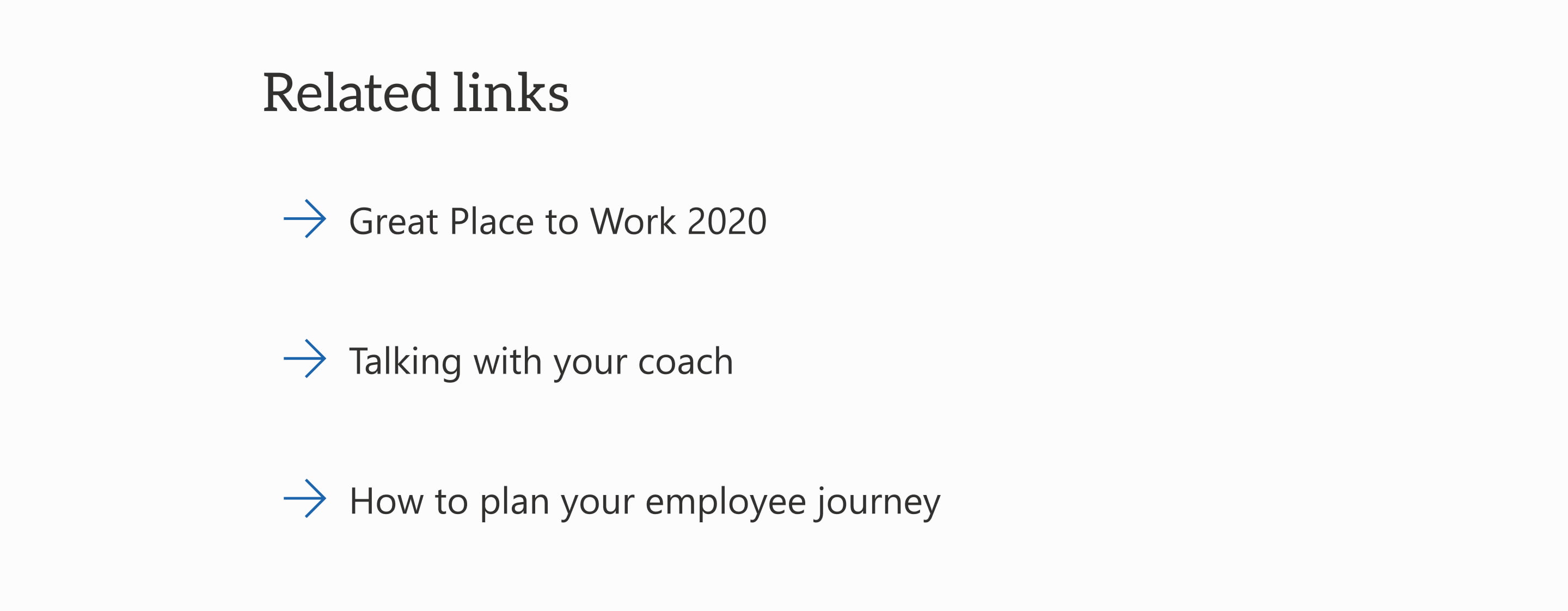
- Related documents and links
- Images, graphics, videos and other media
- Comments
These types of pages in particular are usually created by multiple authors, so saving your news article layout as a template is key to creating some level of consistency.
Here are all the components you might use to create your news article in modern SharePoint:
Title area web part
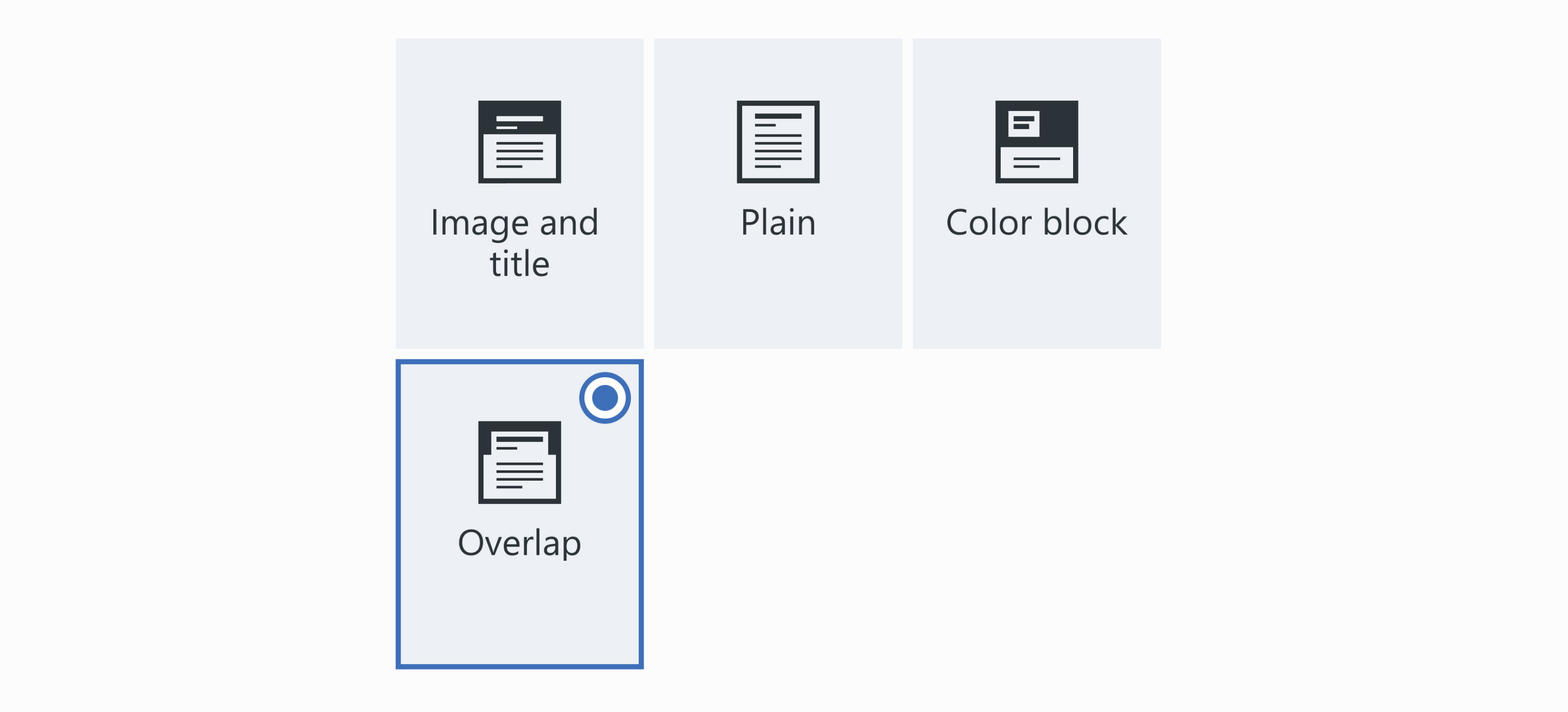
The title area web part, as stated by its name, is where the title of your page goes! It’s also where you’re able to show your published date, the topic header and a banner image. We suggest using the overlap layout here, because it gives you space to show your banner image without pushing the content down too far.
Banner images
It can be difficult to source a relevant photo for every news article. To overcome this limitation, we’ve found success creating a set of default banners that are graphical in nature.
The benefit of this approach is that they can be designed to fit your brand. If you have different types of news posts on your intranet, you can create a set of banners that correspond with your metadata! For example, if you have a news category called “people and culture,” you could use a people icon. If you have a category called “marketing,” you could use a chart icon. Thumbs up for an extra level of wayfinding!
Once these banners are created, you can store them in your organization assets library. This feature is available in out-of-the-box SharePoint, but it needs to be set up by your tenant admin. Storing your banners here allows any content author to access them for their news articles.
Page author
Display your author proudly! News articles are often created by multiple content authors, so make sure to show who wrote it. This gives readers a point of contact if they have questions about anything in the article.
GO FeatureNews metadata web part
Out of the box, there’s no way to display the metadata tags for your news article on the page (womp, womp). The GO page metadata web part can be configured to automatically show an article’s news categories on the page. These tags give employees helpful context when they arrive at your article, so they can quickly understand what your article is about.
Text web part
Most of your news article will be text, so it should be formatted in a way that makes easier for employees to read and understand. One way we like to do this is by using headings.
Headings break up and group content, making it easier to scan. They also give multiple entry points depending on what a reader needs.
Spacer web part
If you’ve read the other insight posts in this series, you’ll know that we love spacers! They help break up your content and add some white space. Remember: white space is your friend! Adding space between different chunks of content helps employees know how the information is grouped. The great thing about the spacer web part is that you can choose how big you want the space to be. Even something as small as 16px can make a huge difference!
GO FeatureDivider web part
Like spacers, dividers are a great way to break up your content. With the out-of-the-box divider web part, you can only control the length of the line and its weight. For GO Intranet, we wanted more functionality, so we created a divider web part that allows you to customize both the size and colour of the divider. We love a pop of colour! And it allows you to enhance the presentation of your brand.
Images, videos and other media
News articles are all about storytelling. If you have images or other media that can help tell your story and provide context, use them!
There are multiple ways to showcase images on pages:
- If you have a few photos, try using them to break up the page content.
- If you have lots of photos, try using the image gallery web part. It takes care of how the photos are displayed, so you don’t need to worry about cropping the photos.
Including images and other media in your news article is a great way to break up your content into more easily digestible sections. However, you should only include them if they help tell your story. Don’t add images just to make it “more visual.”
Quick links web part
The quick links web part gives employees with a shortcut to items related to the news article. To help employees anticipate what will happen when they click on that link, you can use a fluent icon. For example:
- A forward arrow shows employees that they’re going somewhere else in the intranet.
- A navigate external inline icon shows employees that they’re leaving the intranet.
- An icon for the type of document shows employees what type of file they’re going to download.
Make sure your content authors play by the rules and use the icons consistently, so employees know what to expect.
GO FeatureYammer thread comments web part
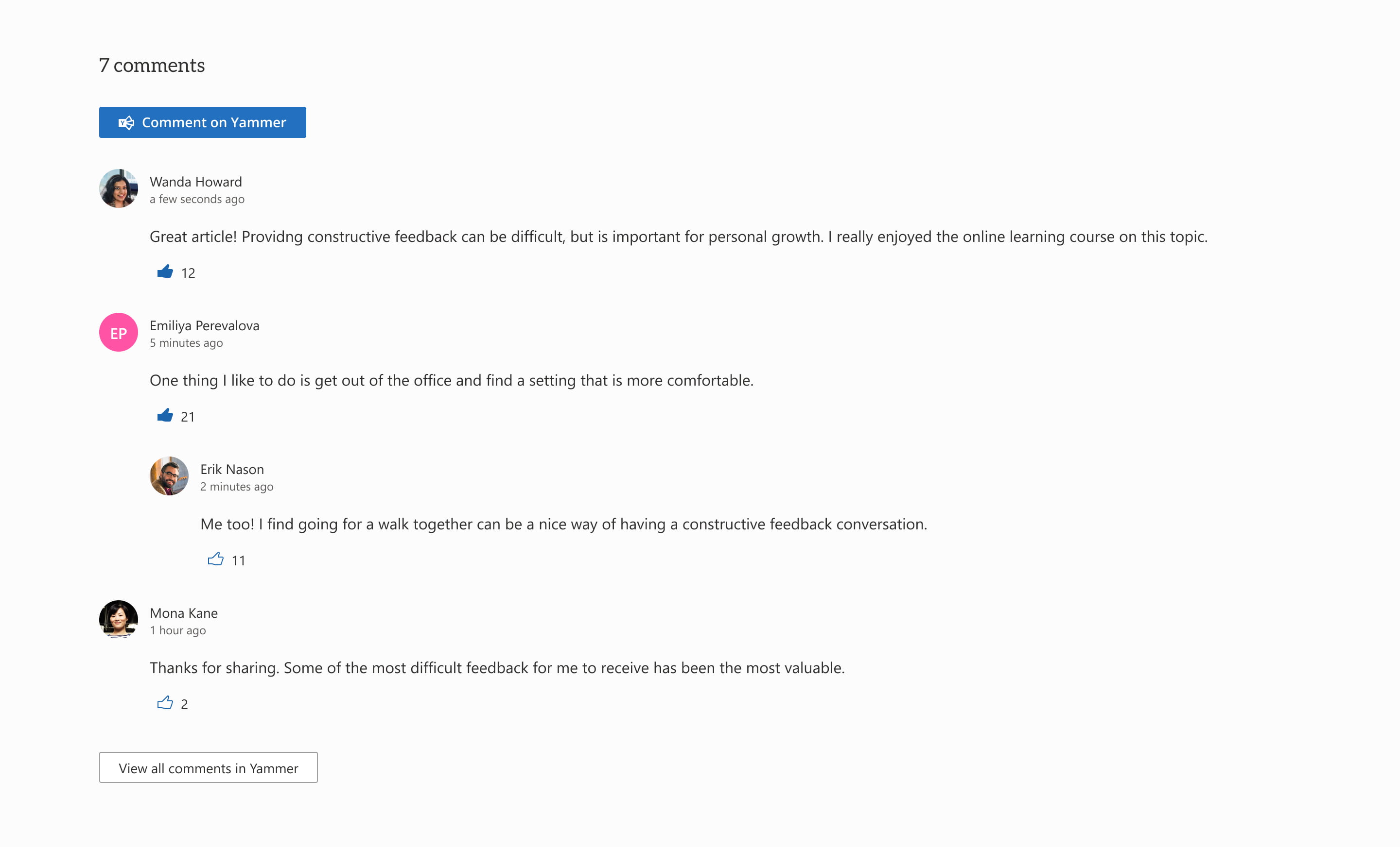
Instead of using out-of-the-box comments in SharePoint, GO’s Yammer comment feature allows you to link your news article to a Yammer thread that people can engage with. If your organization uses Yammer, this web part is awesome because it allows you to keep conversations about the article in one place, rather than have them happening both in SharePoint and Yammer.
News articles are a great place to encourage discussion. Even if you’re not using GO Intranet, you can encourage conversation by turning on SharePoint’s out-of-the-box page comments.
Page thumbnail
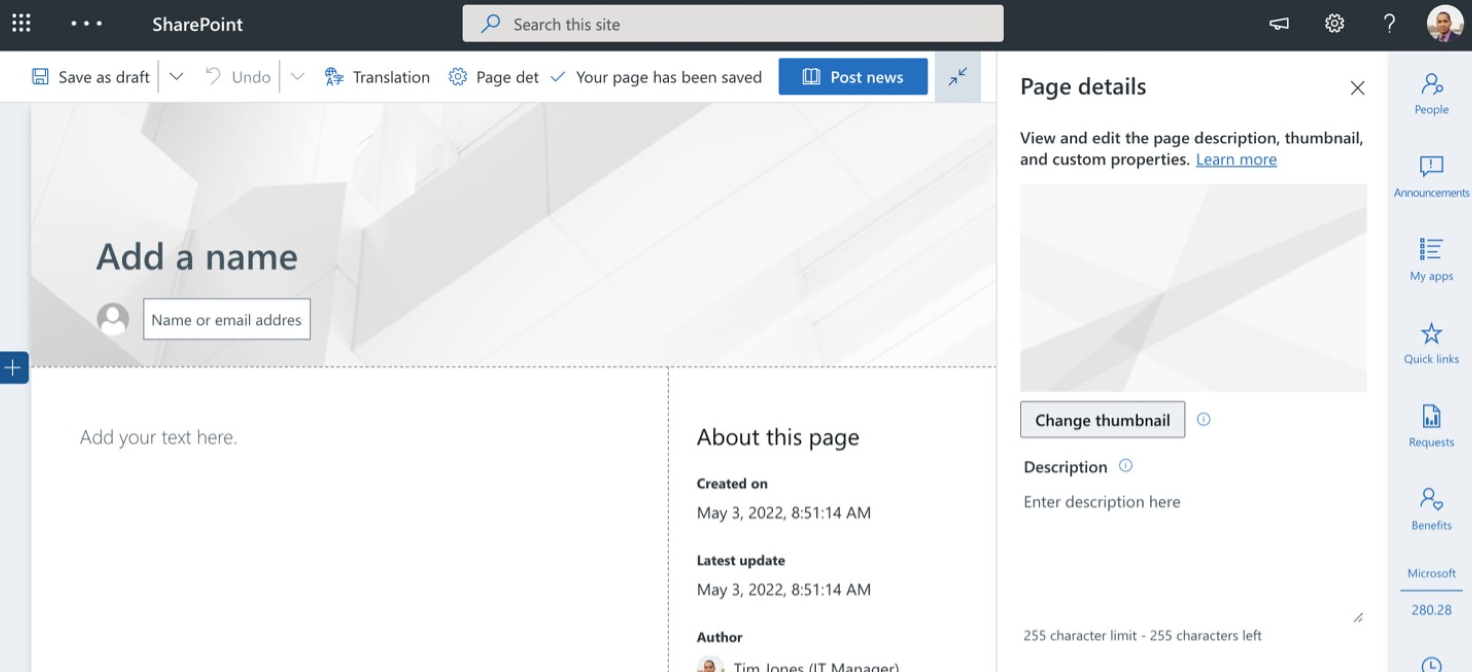
Last but certainly not least, don’t forget to set a page thumbnail for your news article! This is especially important with this content type as it will roll up in your news layout (this could be on your home page – so the stakes are high!). Use an image that gives context to your article and what an employee could expect from reading it.
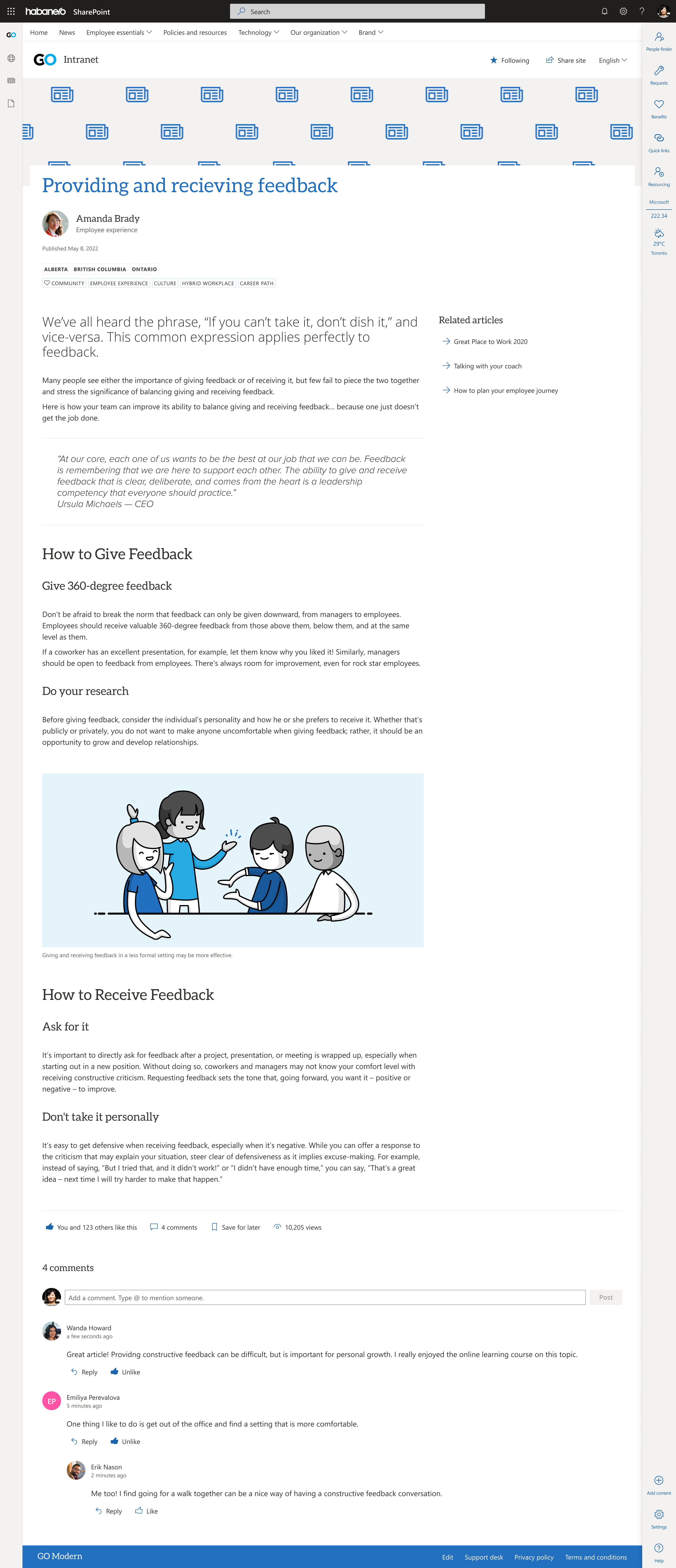
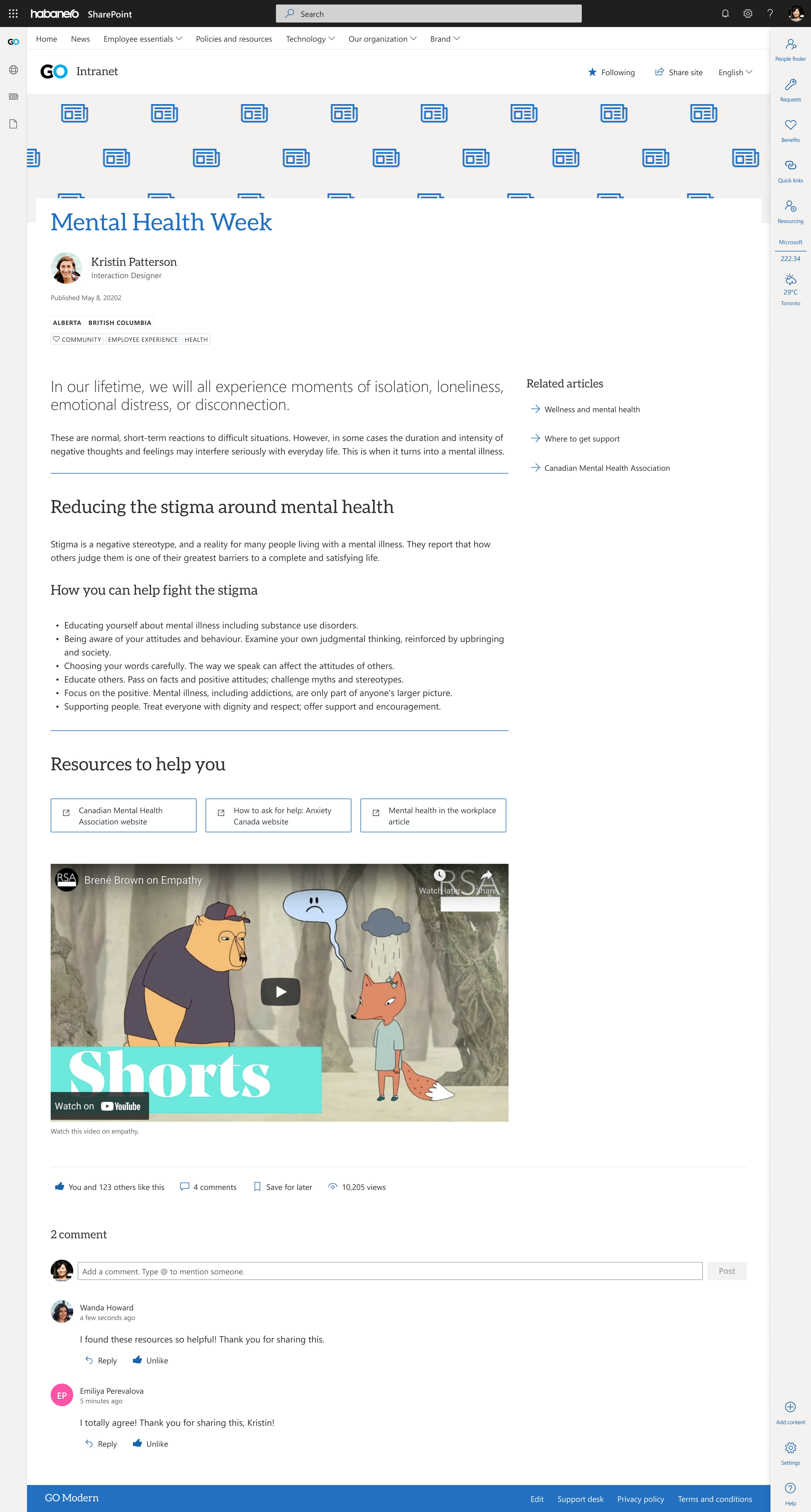
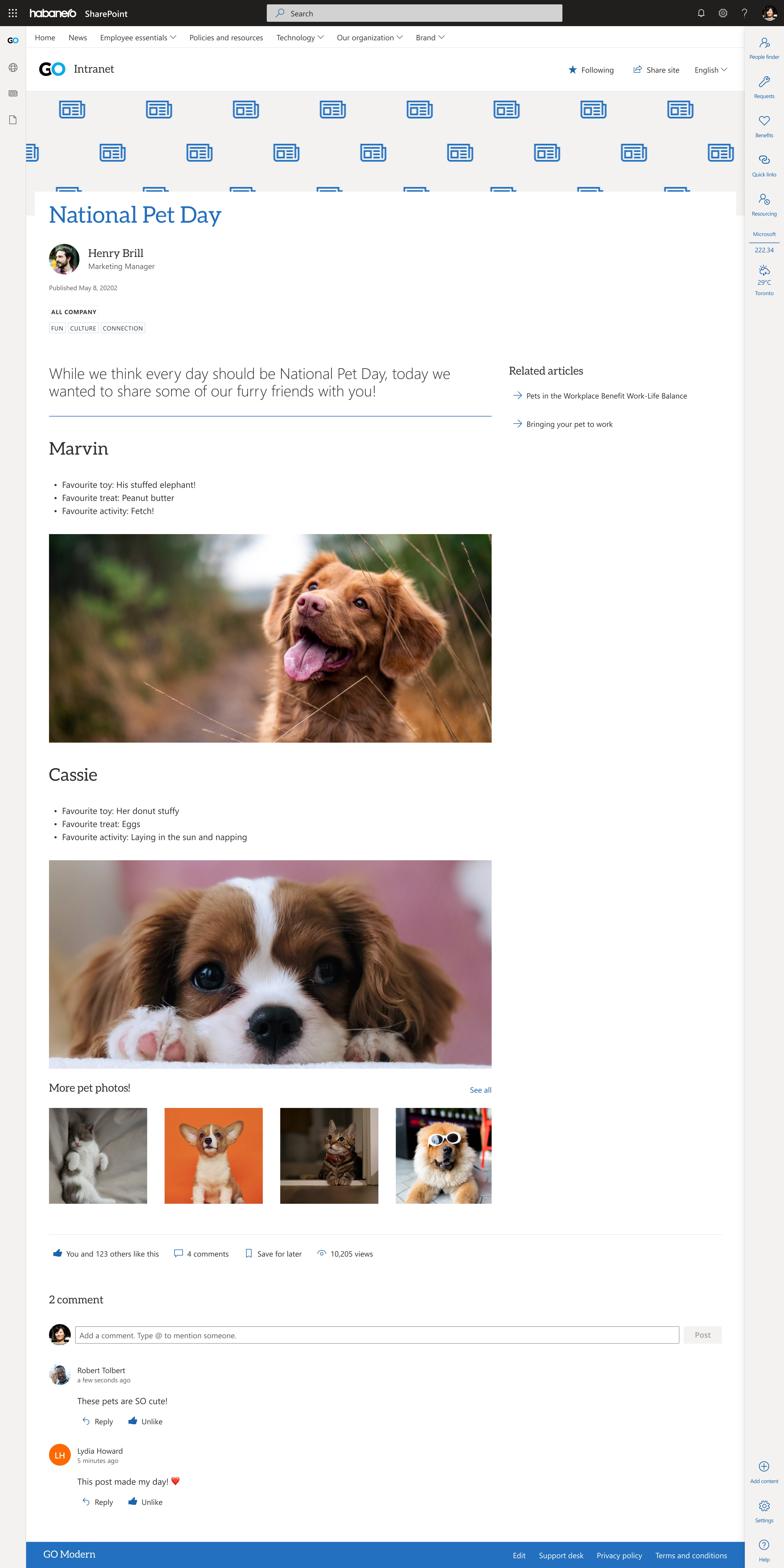
Examples of news articles
Here’s how these web parts might work together to create different news articles on modern SharePoint:
Takeaways
- Remember the job of your news article and use it to help you prioritize what content goes on these pages.
- Use banner images with intention – identify your image strategy and stick to it.
- Show your news categories on your news article. They provide helpful context for employees when they arrive at your article and show what your article is about!
- Use headings and text hierarchy to make it easier for employees to scan and consume your information.
- News articles are all about storytelling. If you have images or other media that can help tell your story and provide context, use them!
- Enable Yammer commenting on news articles to keep conversations about the article in one place rather than split across SharePoint and Yammer.
- Although we try to create consistency with all page templates, content should ultimately guide the design. Not every news article will look exactly the same!
Need help with your intranet’s content? Want to leverage GO Intranet web parts? We can help.
