A roadmap can't be built without first completing the necessary research, including:
- Speaking with the leadership team to uncover what keeps them up at night, what they see as the company’s greatest hurdles, and where they want to see the company in the next six, 12, and 24 months.
- Stepping back for a holistic view of the experience someone goes through when engaging with the company (if it’s an intranet, this is the experience of an employee engaging with the portal itself).
- Setting a compelling vision for the solution
- And some sketching along the way!
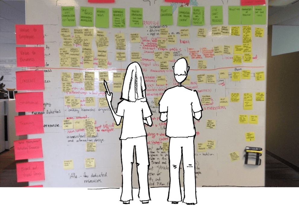
Once you have these pieces, you are ready to complete a roadmap. Find a big empty wall and a handful of colourful sticky-notes. Along the left side of the wall from top to bottom list out:
- value to the customer (or employee)
- the value to the business
- design principles
- viable alternatives
- conditions and requirements for success
These elements will provide the guidance and validation the team and organization need to successfully launch and evolve an intranet or website.
Elements of a roadmap
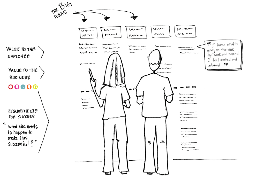
Big ideas
Begin by listing out the big ideas across the top of the wall, starting with the most important on the far left. The big ideas are feature concepts, such as organize, prioritize, and compartmentalize key internal communications.
Value to...
Below the big ideas, list out all of the benefits to the different user groups (for example, employees, customers, and the business). Make sure to write these in first person. For example, "I know what is going on this week, next week, and beyond. I feel involved and informed.”
Principles
Indicate all of the design principles that are supported by this big idea. For example, one of our employee portal clients set principles that included ideas like “one organization,” “globally-recognized workplace,” and “connecting people to people.”
That same organization created these icons that provide a quick visual reminder of the principles throughout the roadmap:
![]()
Viable alternatives
We also include a section called viable alternatives. This section is meant to ask if there a viable alternative to building something custom to address a certain functionality or feature. For example, if an organization wants to have event registration features on its intranet, based on the requirements does a service like Eventbrite meet the requirements or is it absolutely necessary to commit to custom development?
Conditions for success
Conditions for success can include a variety of subcategories depending on the portal and circumstances. Some subcategories include content strategy, governance strategy, training strategy, and portal management activities and resources. A condition for success could be that a new full-time role needs to be created to support the big idea, or that another project has to be completed, such as cleaning up customer or employee databases to support personalization features.
For example, "This feature requires that a full time role be created and a resource hired to manage and write this information."

Prioritization
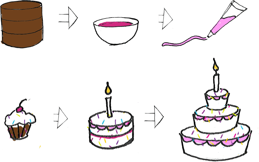
We love this cupcake analogy by Brandon Schauer at Adaptive Path. It’s a great way of prioritizing the big ideas into compelling releases starting with the minimal viable product.

Many companies start with the dry cake, add the tasty filling later, and maybe some icing and sprinkles the next year. Rather, it is better to think about creating something really desirable - the cupcake. This helps stakeholders think about creating the long wow that will increase adoption, create enthusiasm, and ultimately allow the portal design to be nimble and respond to changing circumstances.

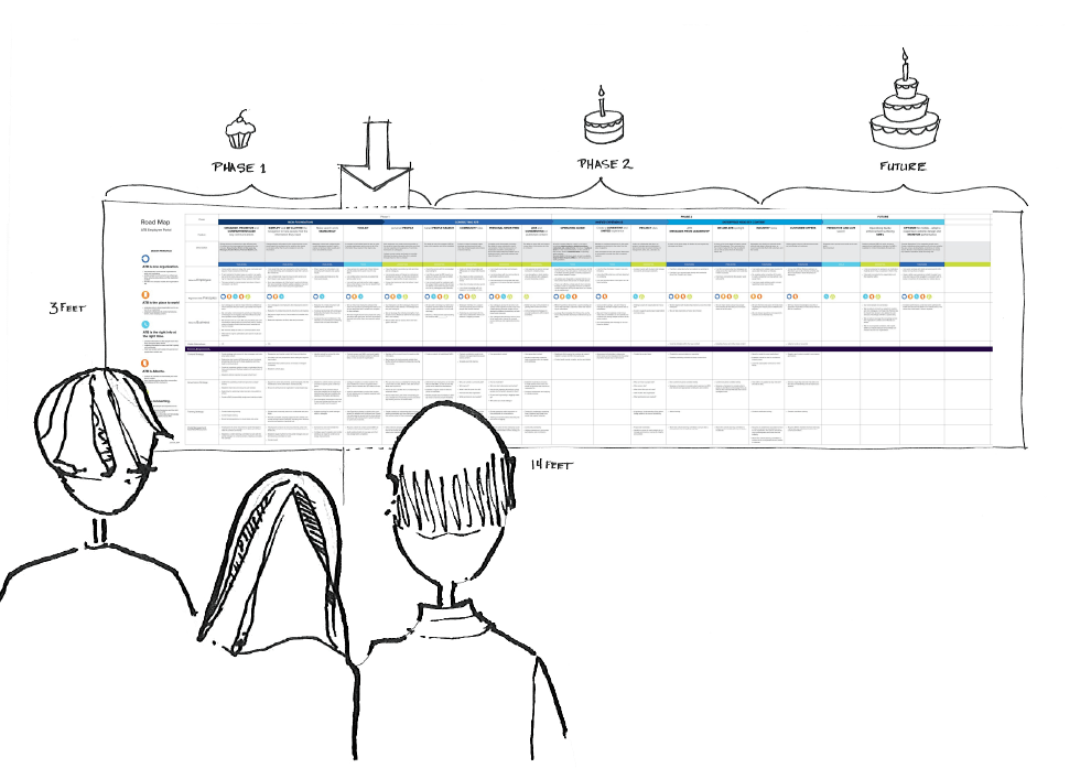
Make it big and visual
We print our roadmaps so that they can hang on a wall and everyone can see the whole thing at once. This allows a group of people to gather around the roadmap to discuss each point, add notes, or tape revisions overtop. In doing this, roadmaps don't get lost in a computer file and opened only periodically. Using colour also groups content together so that the large format is easy to navigate.
These roadmaps should be living documents. Printing them captures a point in time. When we present roadmaps as part of the process, we add sticky notes, edit sections, or completely cross areas off. This instantly makes these documents less precious and invites others to do the same. We have even pulled out a pair of scissors to cut out a large section and reprioritize it by moving it down the wall.

We have created roadmaps in both Excel and InDesign. Excel may not be as visually compelling, but it is effective and allows a greater number of people to update the roadmap digitally.
Roadmaps are a fantastic tool for project visioning through to design, implementation, and portal evolution. It gives the team and stakeholders confidence that functionality will be built and value will be continually delivered to the organization. By tying the big ideas to user goals, stakeholder outcomes, and all the things that need to be in place to make each element successful, a roadmap is an amazing tool to help a team maintain a strong and compelling portal vision.
You can download an Excel version of our roadmap template here!


