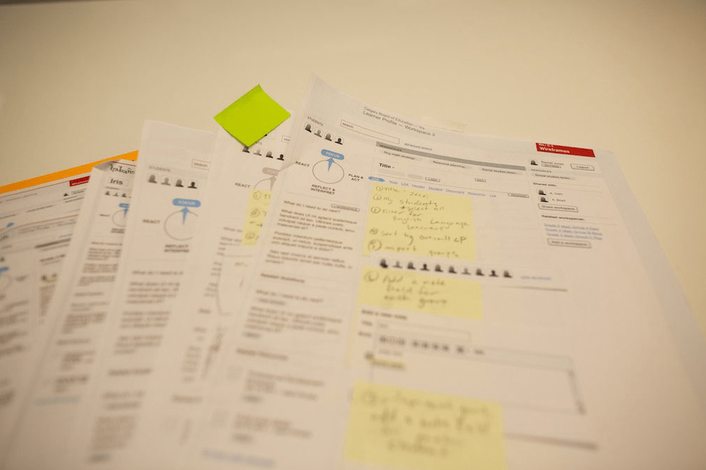
Rough scribbles work their way into more formulated wireframes, and further into polished mockups. The way we represent an idea is reflective of its level of refinement, though we maintain one key component throughout - real content.
But what happens when wireframes just don’t cut it? The process you went through was highly collaborative and user-focused, and everyone was informed of the direction, but that detailed wireframe full of real content and tons of annotations didn’t get the resounding acceptance you were anticipating.
What happened was our ideas outpaced the technologies we were using to convey them, so our presentation fell flat. We went back to the drawing board.
When one of our wireframe presentations failed to resonate, we were in the midst of designing a tool that could be used in a variety of ways to organize thoughts, content, people, or ideas. We realized that the problem wasn’t in the design, but in the way we presented and illustrated the functionality. In this case the pitch just wasn’t going to work without user-generated content to fill it out and effectively demonstrate functionality, but each of our users approached the exercise differently and our content wasn’t reflective of that. A flat wireframe was unable to demonstrate the flexibility of the design or address a variety of use scenarios.
The next day we replaced the wireframes with paper, scissors, and tape, and we replaced the computer with one of our information architects. Using a single sheet of paper containing the basic navigation and header elements and an envelope full of wireframe cutouts illustrating all of the tools available to the user, we asked our audience to provide the content while we simulated how the tool would support the diverse uses. By the end of the exercise, our solution had really connected, and the clients were excited to see it taking shape in such an organic way.

Paper prototyping enabled our team to present functionality and demonstrate the flexibility of our design.
What was more interesting and unexpected was when our client began borrowing the paper prototyping kit and then started requesting more kits. They had adopted the paper prototype for a slightly different use; the kit had evolved into a consultative and educational tool to engage with other stakeholder groups within their organization and gain buy-in.
This experience goes to show that newer, flashier, higher-tech solutions to problems are not always the best. In this case, the solution worked because it was universal (everybody knows how to use a pen and pencil) and flexible, but most importantly it worked because it was the right solution for this particular problem; wireframes, mockups, and other technology-assisted presentation tools aren’t going anywhere, but they are always supported by this old-school tool in our toolbox.


