“So what kind of web design does Habanero do?”
We often are asked this question during initial conversations with organizations as they try to determine if we are the right partner to work on their project.
I believe the answer is simple: design that makes a difference! A couple of recent examples that come to mind for me are the new online reservation process we designed for BC Ferries and the mobile app we created for the Surrey School District. Both solutions connect organizations with their audiences, but more importantly, enrich these relationships.
I believe these (and all of our other) solutions are effective because they are based on our frictionless design philosophy. The core tenet of frictionless design is simple: don’t get in the way of the relationship between a company and its customers or members.
Don’t get in the way
The interaction between many organizations and their audiences is often complex. Visitors often have to choose between different products or services (that are confusing or unintuitive), navigate a complex transaction flow, or complete complicated (but necessary) sign-up processes and forms. Add to this legal and compliance requirements and you often have a solution that negatively influences purchase behaviour, completion rates, and brand perception.
Frictionless-design to the rescue
Our frictionless-design philosophy has four key principles that we leverage to create better experiences:
Learn
We’ve honed our user-centred design methodology to include a fine balance of research, observation, and testing. These informal, collaborative, and rapid techniques are extraordinarily valuable and easy to act on during the development process.
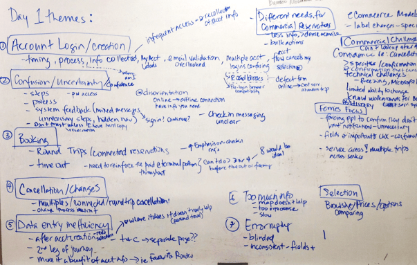
While working with BC Ferries, we used listening labs featuring a number of real personal and commercial customers. These sessions provided our team with a deep understanding of how customers interacted with the solution in the real world. Through the listening lab exercises, our design team was able to gain insight into the end-user challenges of BC Ferries’ old online reservation system.

Our live analysis wall shows themes discovered through our remote listening labs. It’s an approach that helped our project team identify and prioritize the biggest challenges for customers who use the online reservation system.
Simplify
A simple interface is difficult to achieve, and many of the processes our clients bring to us are complex by necessity. We embrace this complexity but strive to create a respectful design that strips away the unnecessary.
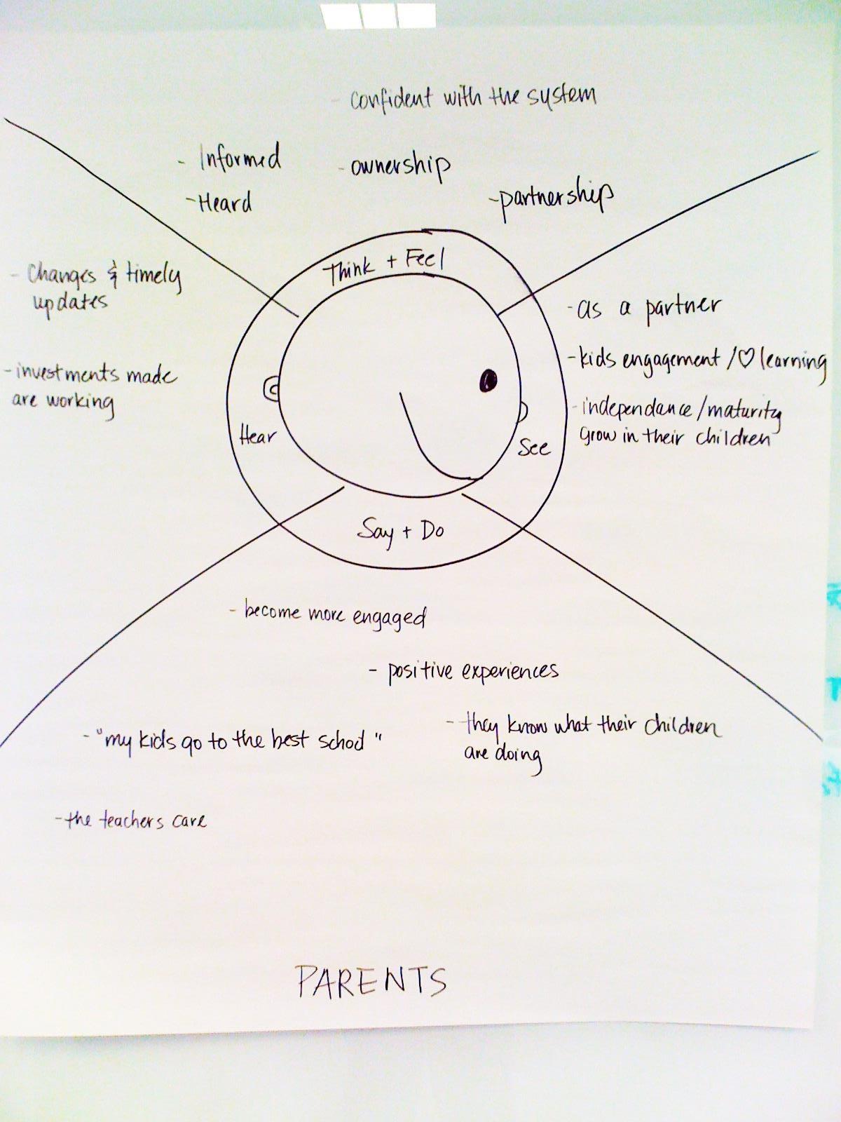
When working with Surrey School District, we used collaborative sketching and empathy maps with a wide-range of stakeholders to enhance our understanding of current processes and expose opportunities for innovation. By focusing on the goals and outcomes of the different stakeholders and audience groups, it was easy to create a mobile solution that fulfilled everyone’s needs.

Creating this parent empathy map with Surrey School District stakeholders helped Habanero understand how the SchoolLink mobile app could enhance the relationships with parents.
Enable
Our solutions lead with relationships and interactions between organizations and their audiences. These interactions are enabled by technology, not driven by it. Our user experience experts work side-by-side with our client’s team to develop a shared vision for the optimal user experience, even when working with the restrictions of legacy systems.

Far too often we let legacy systems or restrictions drive the design process. A core component of great design is understanding the restrictions imposed by legacy systems but finding creative solutions to ensuring that they don’t drive the design.
Delight
Look for ways to anticipate user needs and craft a welcome and delightful experience. For example, an area that generated confusion for ferry passengers was when they needed to arrive at the terminal. We created a small infographic that clearly outlined the process, reducing the number of people that arrive at the terminal too early or too late. This generates a greater feeling of trust between BC Ferries and its customers, and we know trust is key in every relationship.

This easy to understand graphic communicates the 30-minute reservation window and helps travellers understand when to arrive at a BC Ferries terminal. Effective visual communication of a wordy and complex arrival policy avoids frustration at check-in and improves the in-person experience.
Frictionless experiences are compassionate, respectful, and understanding
When designed correctly, online experiences can reduce frustration, increase trust, and ultimately foster a greater sense of connection with an organization.
To us, that’s design that makes a difference!
Mainframe image © Lawrence Livermore National Laboratory


